Primary Logo
The Noora Health Primary Logo was designed to feel approachable and trustworthy. It was updated from the original Noora Health logo to modernize and update the design.
 Download Logo Files
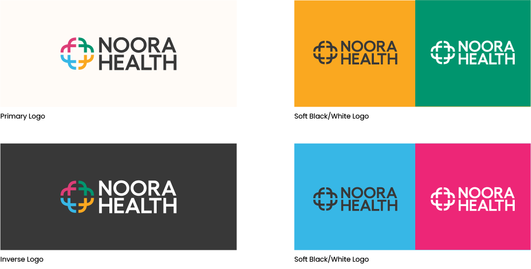
Logo Versions
NOORA HEALTH should only be written in Soft Black and White. No other Primary or Secondary colour should be used for the Logotype.
The soft black logo should be used on light colored backgrounds. The white logo should be used on dark colored backgrounds.
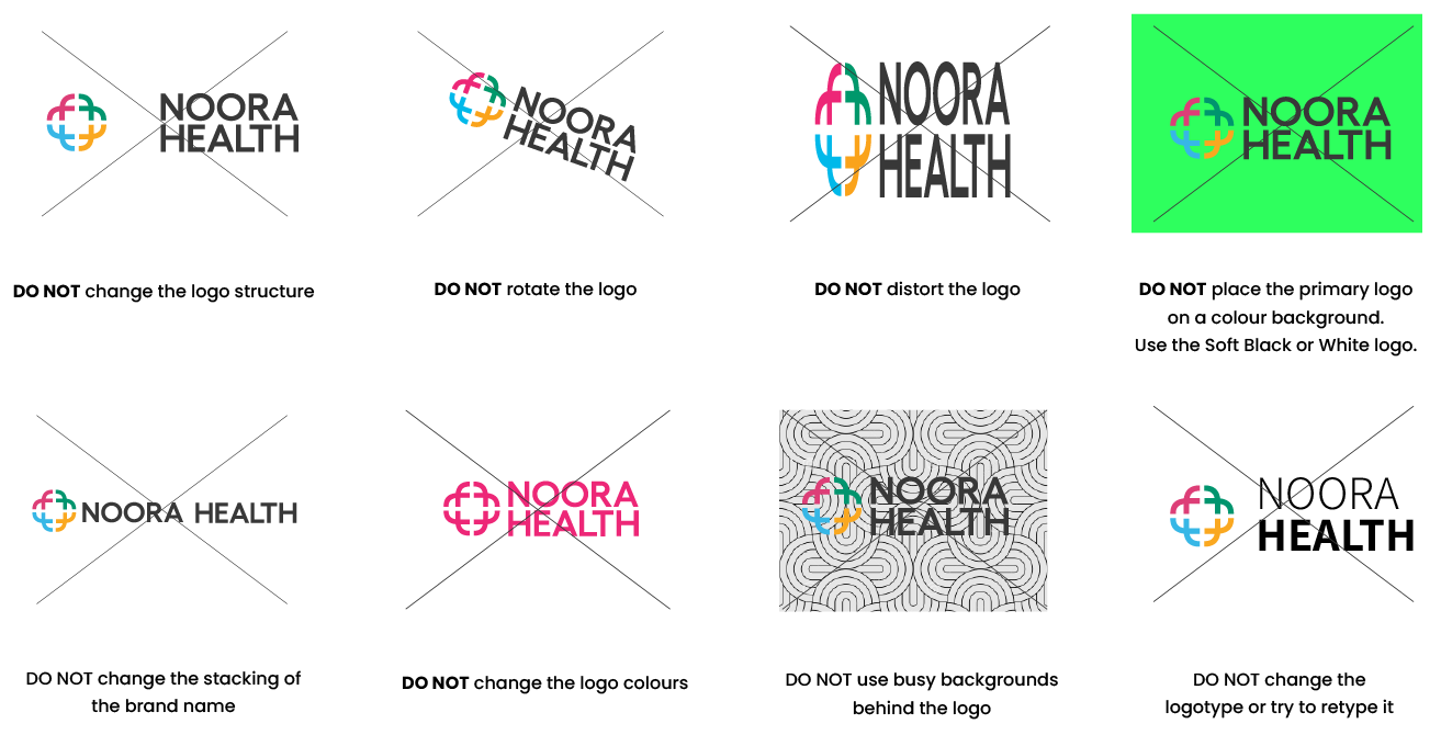
Logo Usage
It’s important that the appearance of the logo remains consistent. The logo should not be misinterpreted, modified, or added to. Its orientation, color, and composition should remain as indicated in this guideline — there are no exceptions.
Noora should always
be written in full as
Noora Health.
It cannot be abbreviated to only “Noora” or “NH”.
This applies for all external brand communications.
Use the Primary Logo wherever and whenever possible.
Use the Primary Logo wherever and whenever possible.Logomark
Logomark can be used on its own as an accent or on any small digital
assets like favicons or social profile pictures.
While the logomark can exist without the logotype, the logotype
should never exist without the logomark.
Colours

R 56 G 56 B 56
R 253 G 250 B 247
C 69 M 62 Y 61 K 54
C 0 M 1 Y 2 K 0
#383838
#FDFAF7
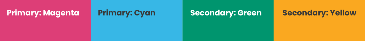
R 221 G 62 B 119
R 55 G 183 B 230
R 0 G 149 B 110
R 250 G 168 B 32
C 8 M 90 Y 29 K 0
C 65 M 7 Y 2 K 0
C 84 M 18 Y 72 K 3
C 0 M 39 Y 98 K 0
#DD3E77
#37B7E6
#00956E
#FAA820
Typography
HEADLINE FONT: Playfair Display
The desire to help the people we love is universal
BODYCOPY FONT: Poppins
Access to caregiver training and support is not. For nearly a decade, we’ve been building Noora Health to address this gap. We believe no one should suffer because of a preventable medical condition.
Please use these fonts in your Noora Health products & projects – print or digital, commercial or otherwise.
When in doubt, use Poppins everywhere.
Frequently Asked Questions
-
Why did we update the logo? And the new website?
The overall brand refresh was driven by form, function, production needs, and our growing organization. Additionally, we wanted a fresh new website and strong, visual storytelling to showcase our team, work, and impact ahead of increased website visits from our TED Talk and Skoll award!
Our original logo will always maintain a special place in the story of Noora Health, but it needed to grow and scale along with the organization. Think of this updated logo as an homage to our original logo – just slightly cleaner and more production friendly.
-
Where can I access the new logos?
-
Who do I go to for questions about the brand?
-
What happens if I see a document or material with old branding?
-
Do I need to update past materials with the new fonts and logos?
-
How do I get these fonts into my Google Suite?
-
Which fonts should I use for Hindi and other languages?
-
Where can I find a Google doc template?
-
Where do I find the Noora Health letterhead?
-
Where do I find the Noora Health overview deck and template?
If you are having trouble with anything in this guide, you are missing brand elements from the brand package, or you are unsure if your communication best represents the Noora Health brand,
Join the Slack channel: